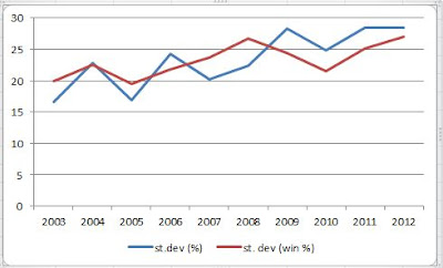
2012 is actually at the top for both categories, suggesting this is the most uneven season of the past decade. However, when the pundits talk about this being an even season, they are probably talking about the top 10 or 12 teams, and discounting GWS, Gold Coast and Melbourne. Given that North, Richmond and the Bulldogs are all on 16 points, let's take our cutoff as 13th spot where the Dogs sit. This graph shows the variations in winning percentages and for/against percentages across the top 13 AFL teams after Round 9 for every season since 2003:
Alright now the 2012 ladder is looking more even, particularly compared to 2011, although not as even as 2003 and 2007. Though maybe if you just took the results of the top 13 teams against each other (that is, exclude results involving the bottom teams), it might come out as the most even.
To put the point another way, consider this. This is the AFL ladder after Round 9 this season:
| WC | 9 | 32 | 142.6 |
| ES | 9 | 32 | 140.2 |
| AD | 9 | 28 | 127.4 |
| CW | 9 | 28 | 110.9 |
| SY | 9 | 24 | 130.7 |
| CA | 9 | 24 | 128.9 |
| SK | 9 | 20 | 118.8 |
| HW | 9 | 20 | 116.4 |
| GE | 9 | 20 | 103.7 |
| FR | 9 | 20 | 95.5 |
| NM | 9 | 16 | 112.7 |
| RI | 9 | 16 | 110.6 |
| WB | 9 | 16 | 93.2 |
| BL | 9 | 12 | 87.7 |
| PA | 9 | 12 | 86.7 |
| GW | 9 | 4 | 47.3 |
| GC | 9 | 0 | 60.2 |
| ME | 9 | 0 | 51.8 |
And this was the AFL ladder after Round 9 in 2003:
| BL | 9 | 30 | 124.6 |
| WC | 9 | 28 | 130 |
| PA | 9 | 24 | 119.5 |
| FR | 9 | 24 | 113.7 |
| RI | 9 | 24 | 107.9 |
| AD | 9 | 20 | 117.9 |
| SY | 9 | 20 | 107.2 |
| CW | 9 | 20 | 105.1 |
| KA | 9 | 18 | 93.4 |
| ES | 9 | 16 | 99.8 |
| SK | 9 | 16 | 84.7 |
| ME | 9 | 12 | 87.7 |
| HW | 9 | 12 | 84.1 |
| CA | 9 | 12 | 81 |
| GE | 9 | 8 | 84 |
| WB | 9 | 4 | 82.4 |
Which ladder looks the more even to you?


No comments:
Post a Comment